
In 2019, Origami Creative refreshed the brand of Clínica Veterinaria Macul: a new visual identity, a brand manual and photography of the team at work. The redesign replaced a logo built around a red cross with a symbol of its own, a pulse line that draws the M of Macul, and turned it into a complete system: versions for every background, colors, typography and graphic resources for everyday pieces.
- Client
- Clínica Veterinaria Macul, a 24/7 veterinary clinic in Ñuñoa, Santiago, Chile
- Year
- 2019
- Industry
- Veterinary health
- Origami's work
- Visual identity, brand manual and photography
The starting point
Macul is a clinic with a long history: according to its own website, it has more than 30 years of experience and is open around the clock. Its previous logo combined a red cross with an arc and the name set in three lines, with "Macul" in a very heavy black typeface.
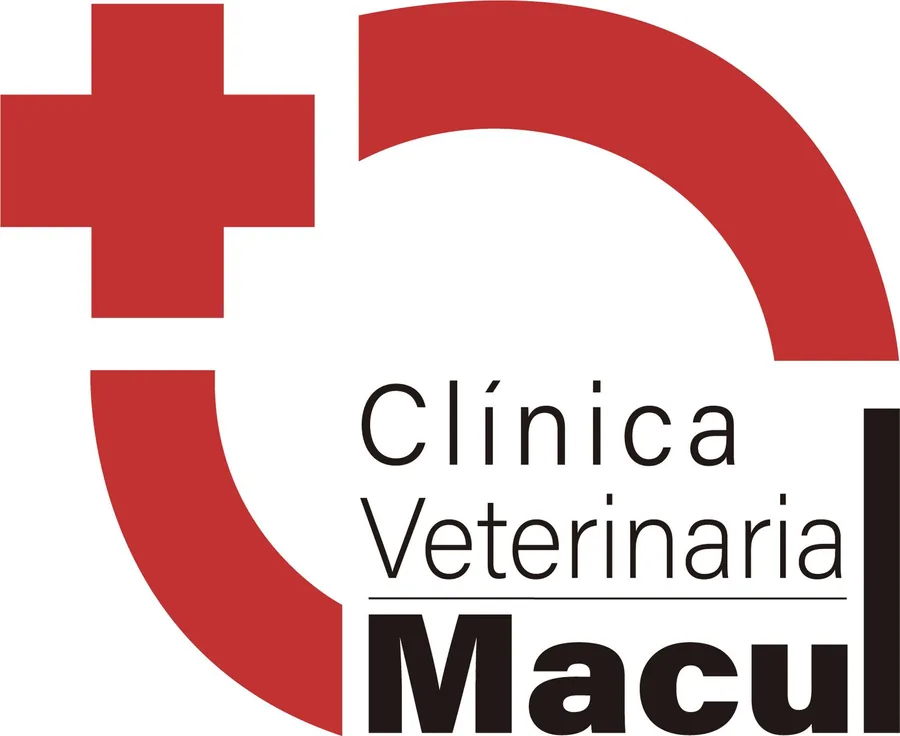
The cross is a device shared by many clinics and health centers. It communicates the category, but it does not set one clinic apart from another. The refresh kept what the brand already had, the red and the name, and gave it a symbol that belongs only to Macul.
The new identity
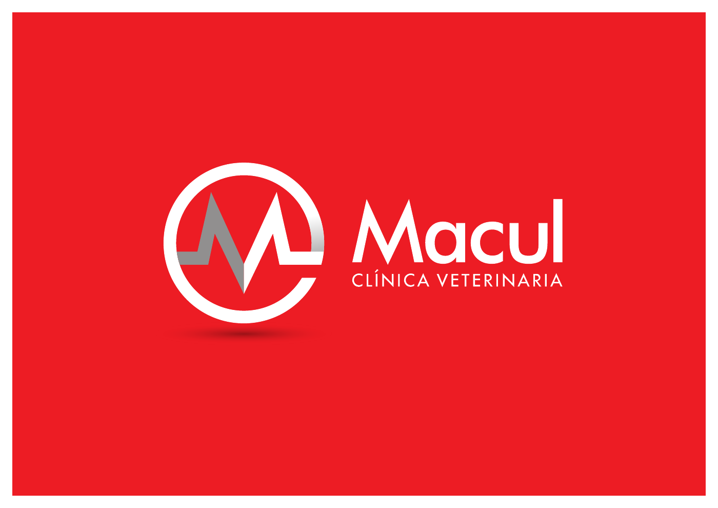
- A symbol of its own. Inside a circle, a pulse line forms the M of Macul. It speaks of health without relying on the cross.
- The red stays. The color of the previous logo remains the brand color, now also applied to full surfaces.
- The name leads. "Macul" becomes the first thing people read, with "Clínica Veterinaria" as the tagline. The typeface is Futura, a highly legible geometric sans serif.
A system, not just a logo
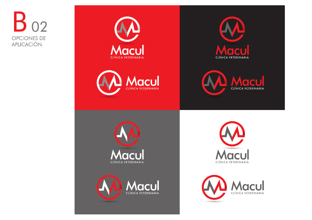
The brand manual defines how the identity is used in each situation, so the clinic, its suppliers and whoever runs its social media apply it the same way.
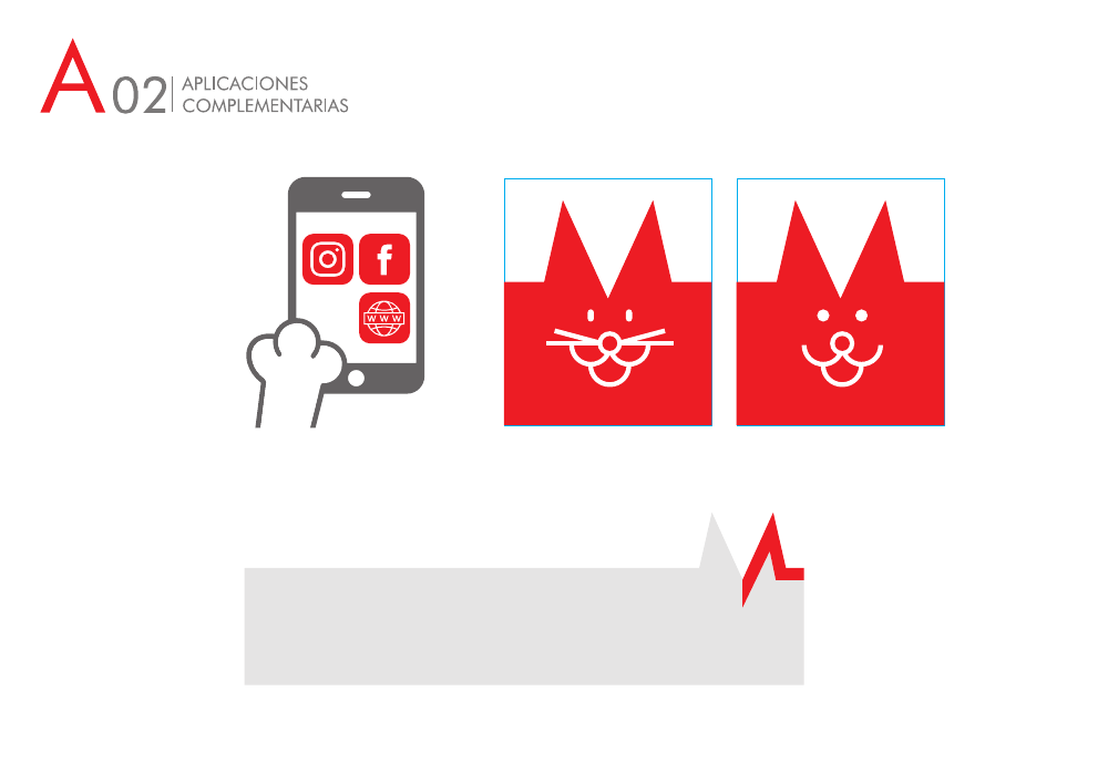
The system adds graphic resources derived from the symbol itself. The peaks of the M become the ears of a cat and a dog, used for icons, social media and informational pieces without leaving the identity.
The brand in use: team photography
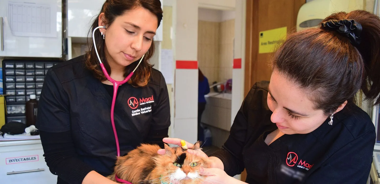
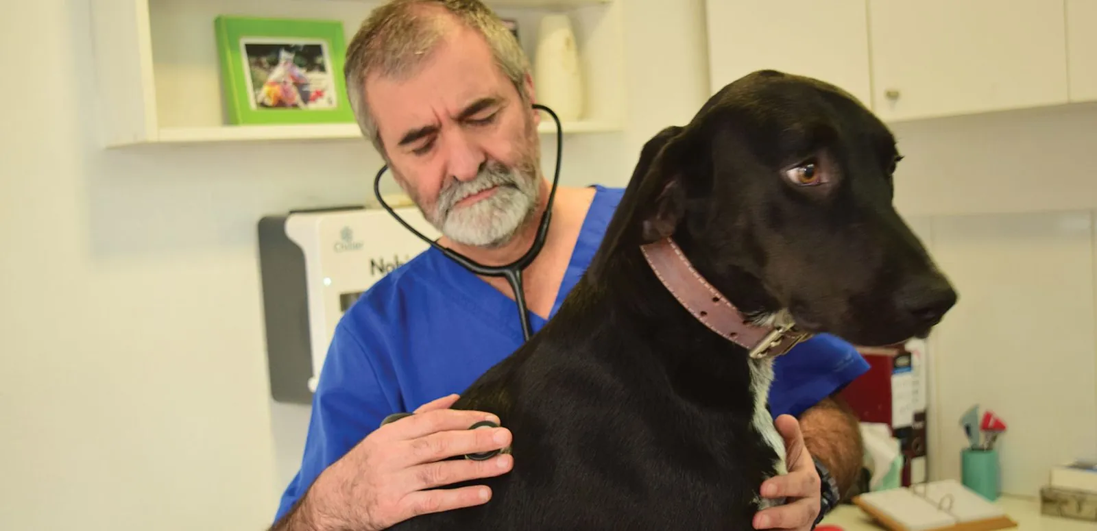
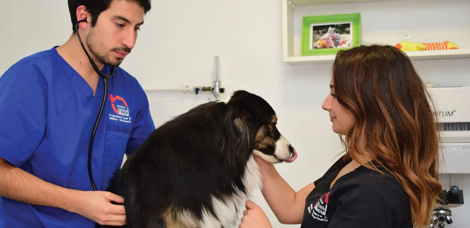
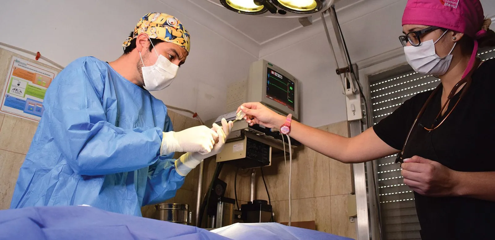
A new identity needs images to go with it. Origami photographed the clinic: the team in their uniforms, patient care and work in the operating room. These are original images that show the clinic's real people instead of stock photos.
What this case teaches
- Keep what the brand has already earned. A redesign does not have to start from scratch: keeping the color clients recognize makes the change feel like an evolution.
- Replace the generic symbol with your own. A device the whole industry uses communicates the category, not the brand.
- Design the complete system. Versions, resources and the manual are what keep the identity consistent when other people apply it.
- Show the real team. Original photography is what finally brings the brand into the clinic's everyday life.
If your brand is at a similar point, also read when to refresh your company's image and what a brand manual should include. Learn about our strategy and branding and photography services.
Does your brand need an evolution like this one?
Let's talk →