Origami Creative has worked with Sedivet, a veterinary diagnostic center in Lo Barnechea, Santiago, since it opened in 2016. Over ten years, the work has covered almost everything the brand touches: refining the logo, the façade sign, interior signage, stationery, brochures, newsletter, social media, forms, conference booths, photography and the website. It is a long-term relationship in which every new piece starts from the same system.
- Client
- Sedivet, a veterinary diagnostic center in Lo Barnechea, Santiago, Chile
- Relationship
- Since 2016
- Industry
- Veterinary diagnostics and continuing education
- Origami's work
- Branding, signage, brochures, posters, newsletter, social media, forms, booths, photography and web
"Excellent work for our company. The web design and the branding are of very high quality. I will definitely recommend them."
A high-tech veterinary center
Sedivet offers MRI, electrodiagnostics and endoscopy for veterinary patients. It also runs a continuing education unit with advanced courses for veterinarians. Its message, "a high-technology center for safe, minimally invasive diagnostics", has to reach a pet owner as clearly as a professional attending a course.
The brand: refining the logo, not replacing it
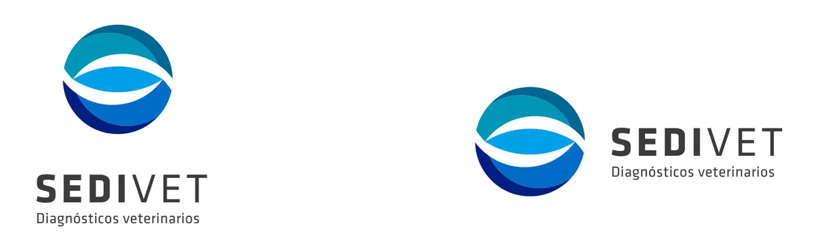
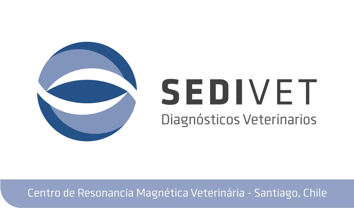
Sedivet came with a logo of its own: a circle with a stylized eye, built from four shades of blue and turquoise. Origami did not replace it; it refined it. It kept the idea of the symbol and simplified its construction to two flat shades of blue, a firmer version that reproduces the same way on a business card, embroidery, a façade sign or a screen.
The center: façade, wall and signage
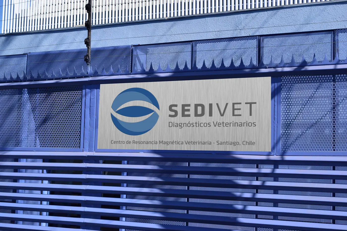
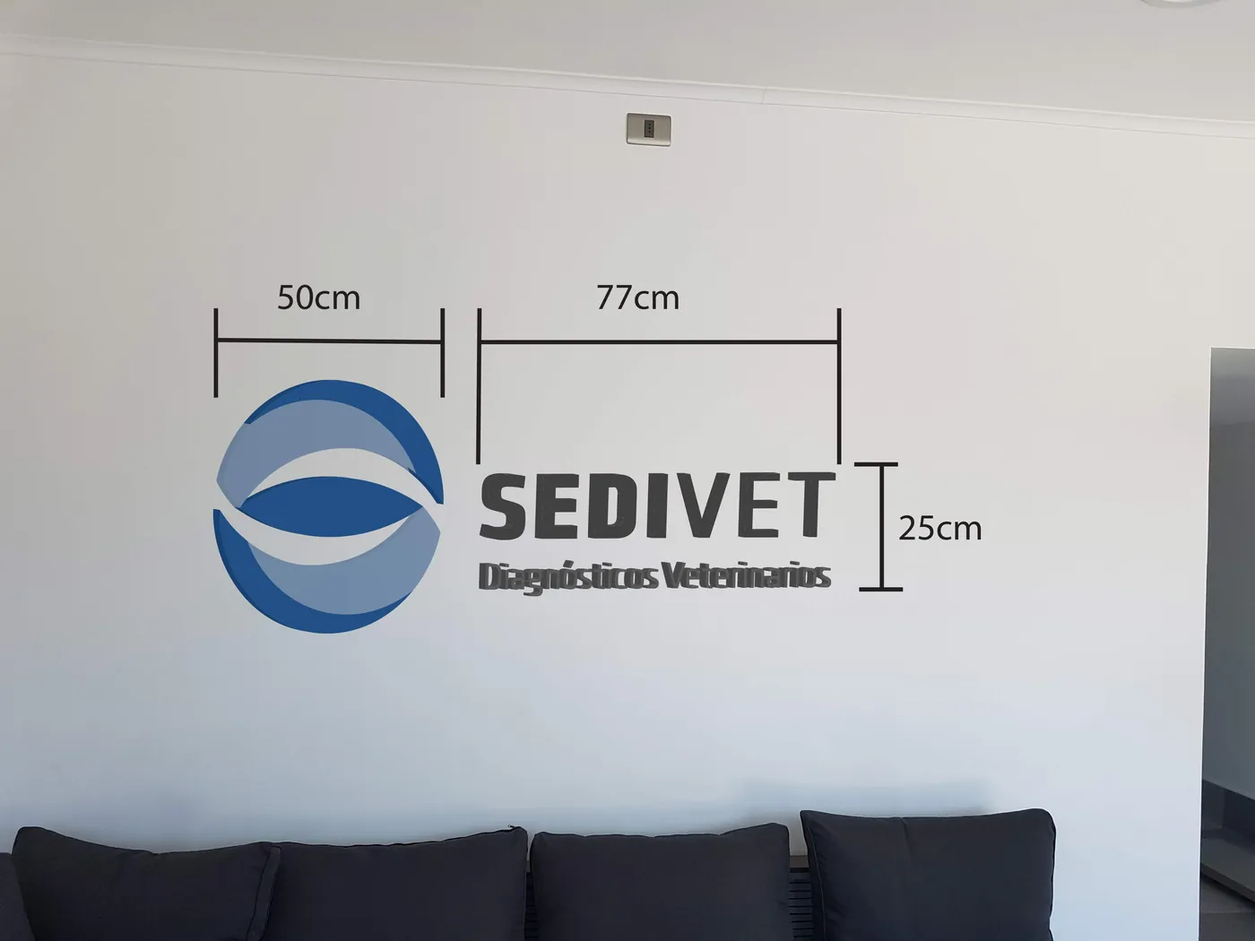
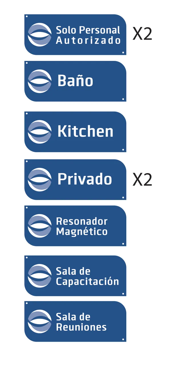
The brand also lives in the building. Origami designed the façade sign, with the tagline "Centro de Resonancia Magnética Veterinaria" (Veterinary MRI Center), and the interior wall logo, specified with its installation measurements. Interior signage uses the same system on every door: the MRI room, training room, meeting room, private areas and restricted-access areas.
Stationery and brochures
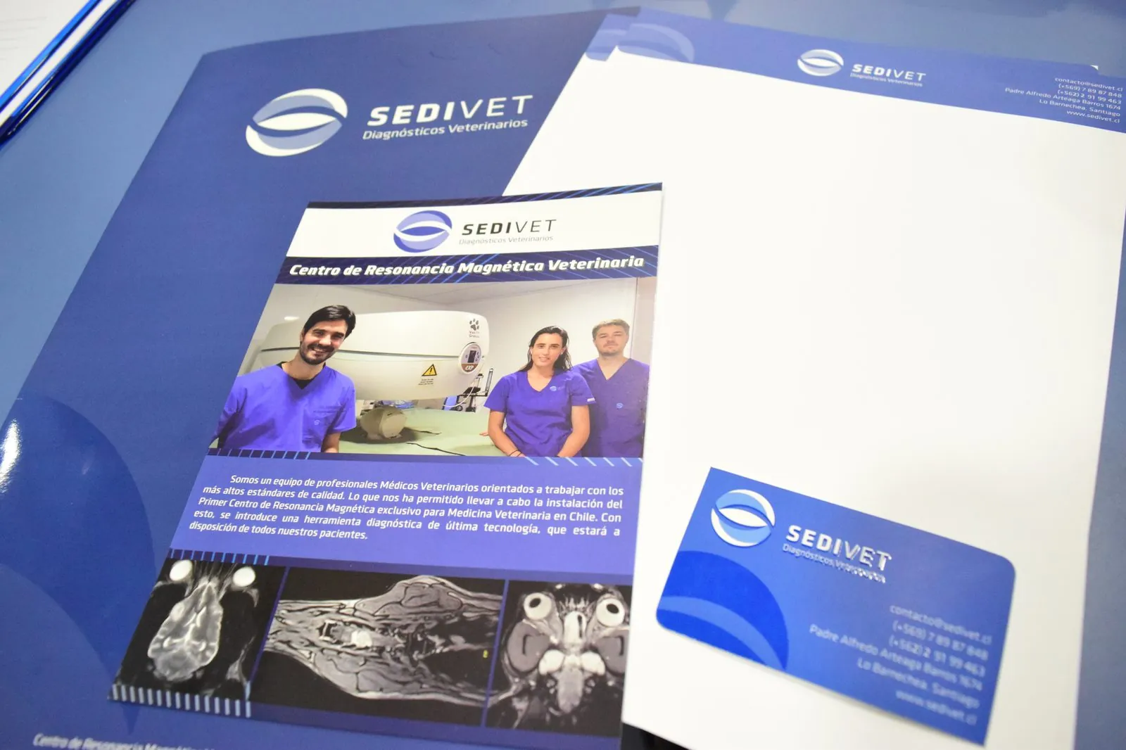
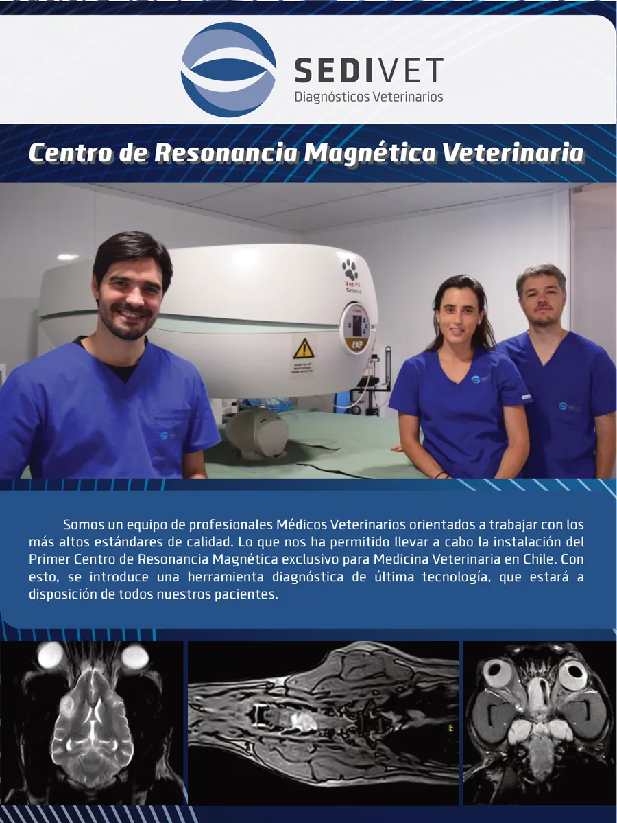
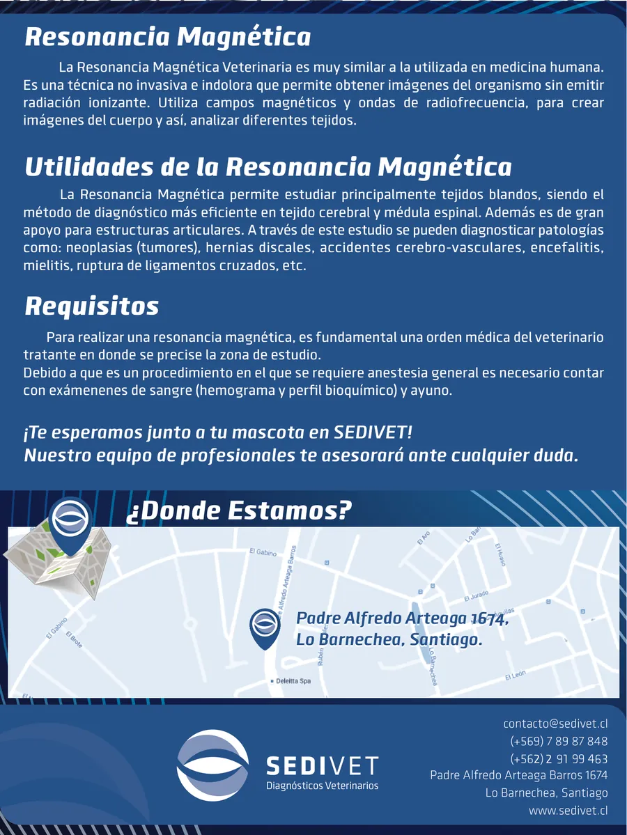
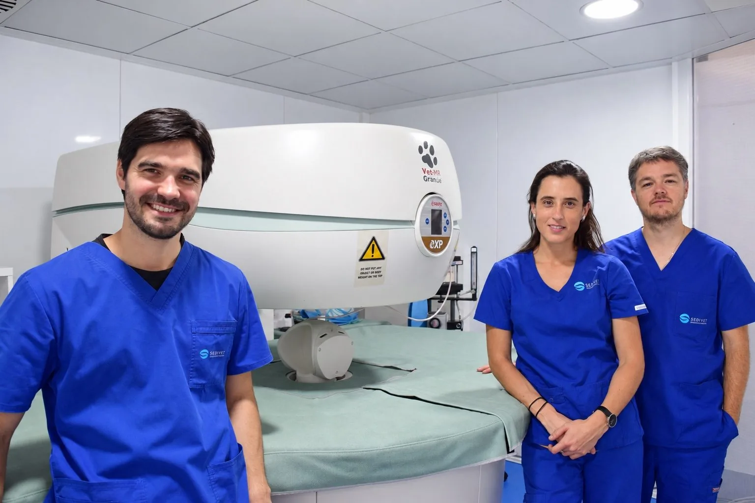
Stationery and brochures repeat the same resources: blue backgrounds with curves taken from the symbol, the logo always in the same position and the photo of the team next to the MRI scanner. One side of the brochure explains what the center is; the other explains what an MRI is, what it is used for, what the exam requires and how to get there. In it, Sedivet presents itself as the first MRI center exclusively for veterinary medicine in Chile.
Continuing education: courses, newsletter and social media
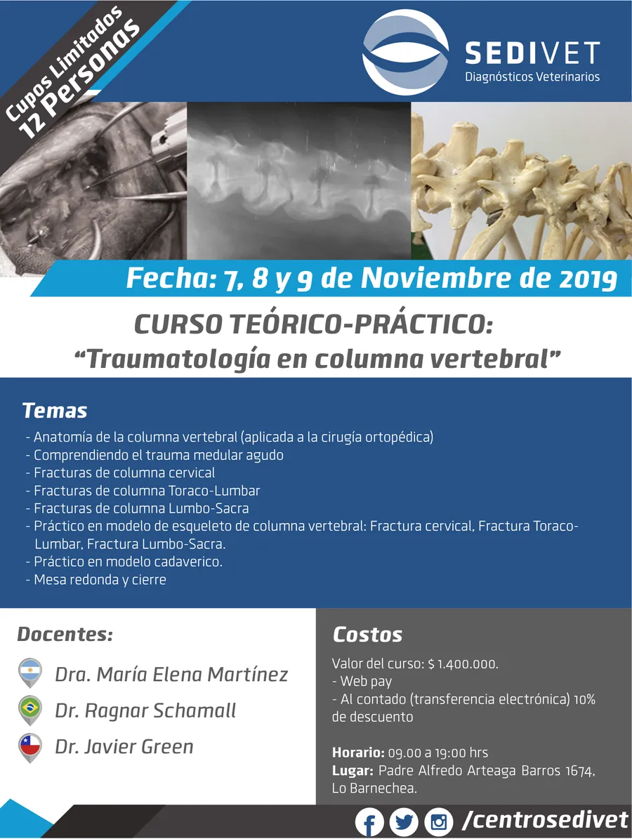
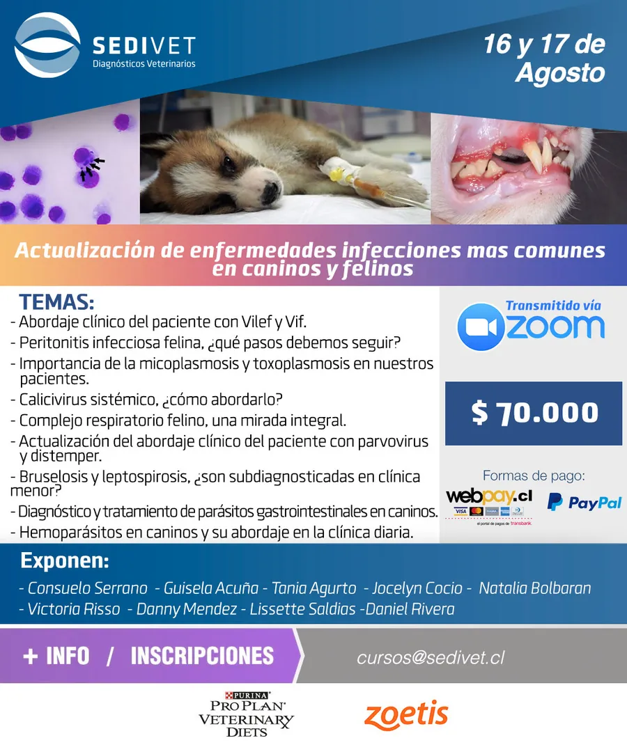
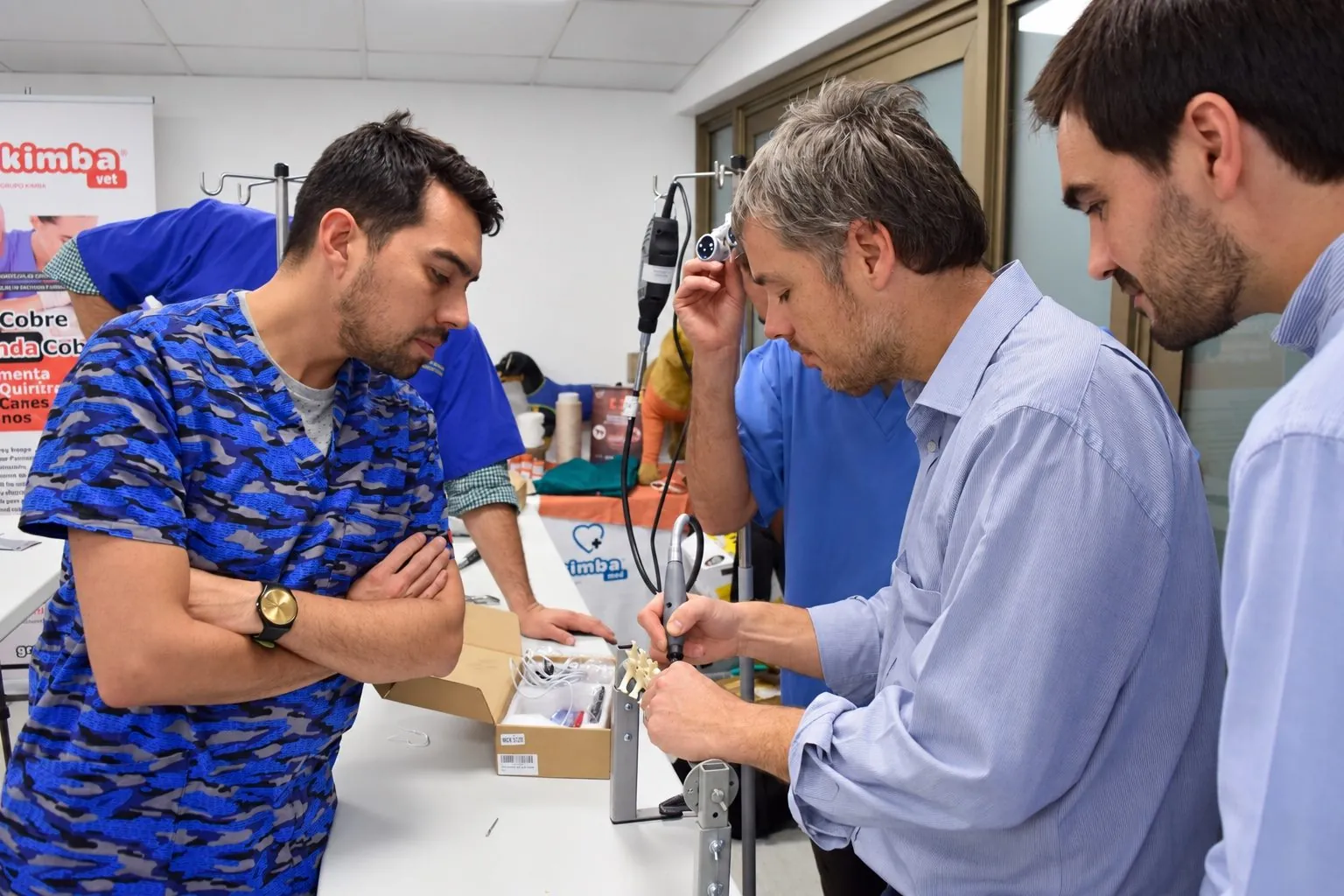
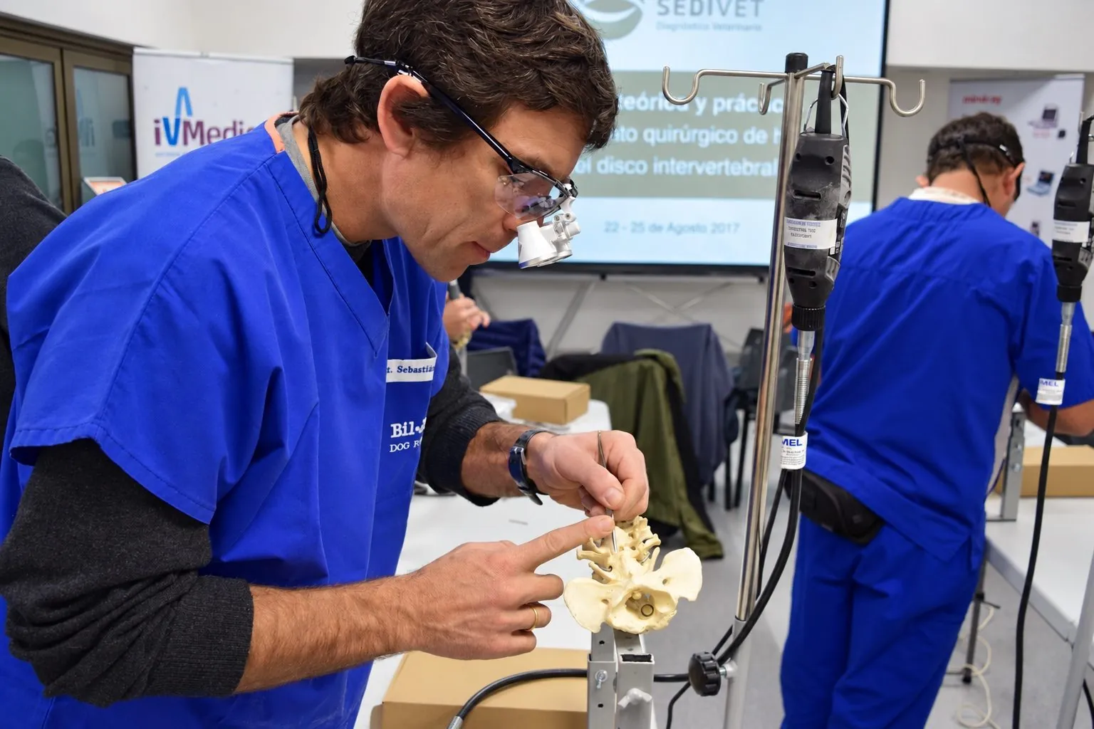
Sedivet's training unit needs constant promotion. Origami designs the pieces for each course, in person or online, for social media and email: the hands-on course on spinal traumatology, with limited places, or the update on infectious diseases in dogs and cats streamed on Zoom. Every piece organizes the same information: dates, topics, instructors, fees and registration.
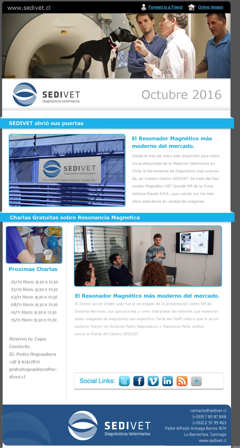
The newsletter has been with Sedivet from the start. The October 2016 edition announced the opening of the center, introduced the MRI scanner and invited readers to free talks about MRI.
Conferences: the brand in three dimensions
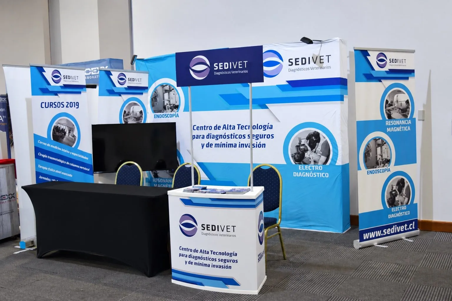
For the International Meeting of Small Animal Surgery, Origami designed Sedivet's booth: the backdrop, the counter and a banner for each service, plus one for the courses. Each banner presents a service with its own photograph, so the booth reads as a map of what Sedivet does. Origami also developed graphic pieces for the conference and its photo coverage, which you can see in the conference section.
Photography: the team at real work
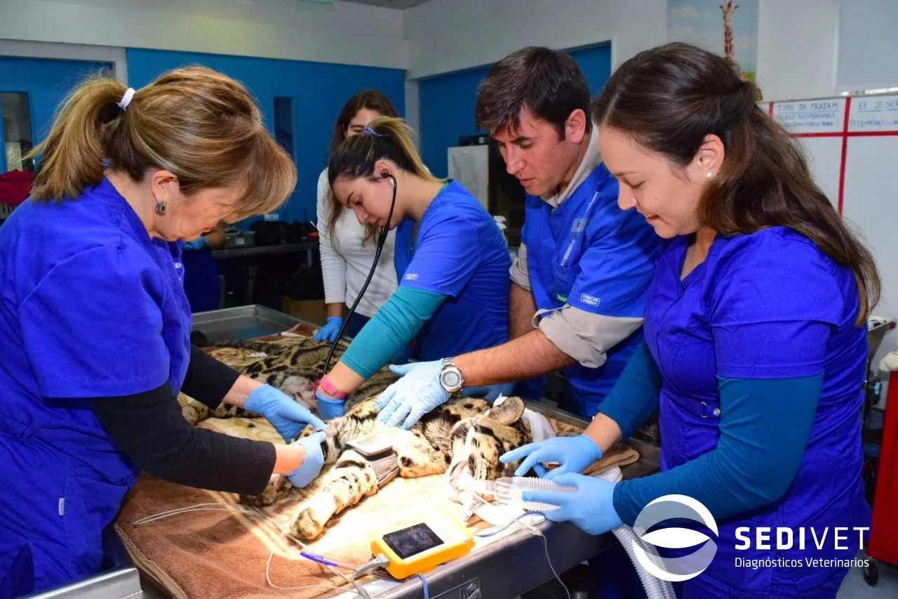
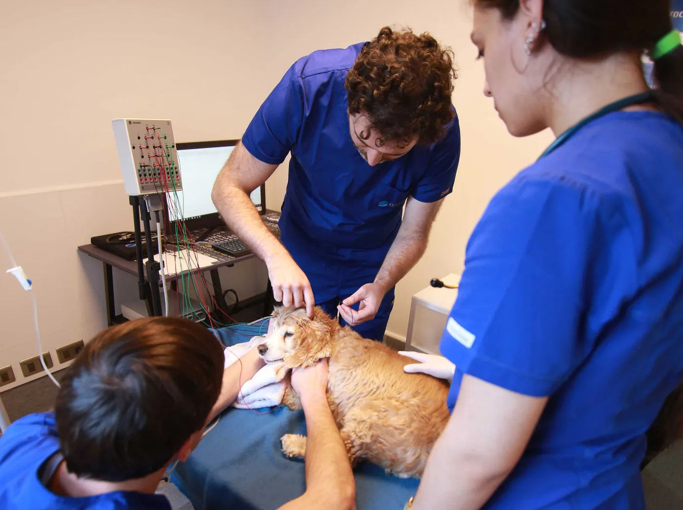
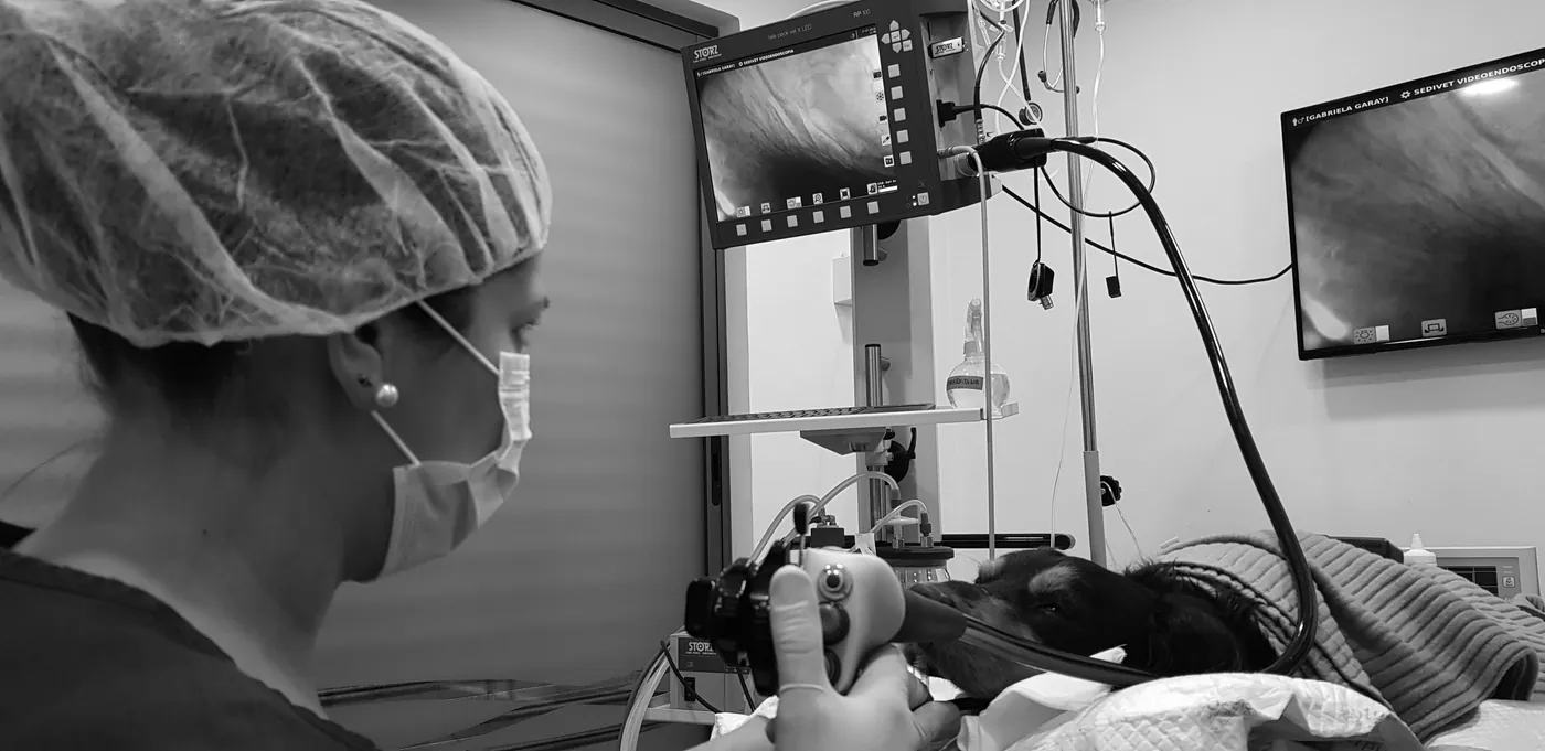
Sedivet's images are original. They show the team next to the MRI scanner, during exams and procedures, and in continuing education activities. These are the photographs that later appear in the brochures, the booth, social media and the website.
The website
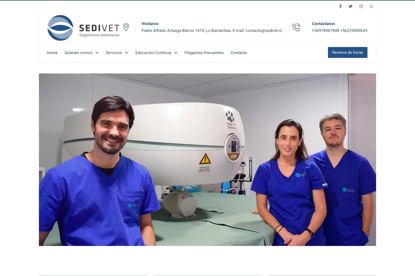
The site organizes what Sedivet offers into services, continuing education and FAQs, with appointment booking always visible. The photo of the team next to the scanner, the same one used in the brochures, connects the website with the rest of the pieces.
What a long-term relationship makes possible
- Consistency without extra effort. When the same team looks after the brand for years, every new piece starts from a known system, not from scratch.
- An original image library. Photos of the team, the facilities and the courses are reused in brochures, booths, social media and the web.
- Brand memory. Decisions from previous years stay within the same approach and are not lost when switching suppliers.
- Fast response. A conference, a course or a new room is solved with pieces that already speak the same language.
Also see the Clínica Veterinaria Macul case study, read what a brand manual should include or learn about our strategy and branding and photography services.
Looking for a team to support your brand over time?
Let's talk →